Exercise 2.2
Variability is a matter of how spread out the histogram is. In this case, there is a value in the 812 to 817 interval, and, on the other side, a value in the 867 to 872 interval. (Note in both intervals, the frequency is shown as 1, so there is only one value.) We'd say there was virtually no skewness.
Exercise 2.3
The stem-and-leaf display gives interval width of 10, in contrast to the width of 5 in the histogram. In effect, the stem-and-leaf display centers the intervals at 815, 825, etc.; the centers for the histogram also differ. The two pictures aren't identical.
We see basically the same pattern in both displays. The average value is somewhere in the 840's, there is modest variability, and there is very little skewness.
Exercise 2.11
| 547 | 625 | 630 | 656 | 664 | 667 | 667 | 667 | 679 | 688 | 688 | 688 | 688 |
| 688 | 691 | 694 | 697 | 699 | 700 | 701 | 702 | 703 | 703 | 703 | 708 | 711 |
Exercise 2.12
| 54 | 7 |
| 63 | 5 |
| 63 | 0 |
| 64 | |
| 65 | 6 |
| 66 | 4 7 7 |
| 67 | 7 9 |
| 68 | 8 8 8 8 8 |
| 69 | 1 4 7 9 |
| 70 | 0 1 2 3 3 3 8 |
| 71 | 1 |
Exercise 2.17
Exercise 2.18
Exercise 2.70
             FOOD
Minimum              61.22
Maximum              70.74
Mean                 66.02377
Median               65.81
Standard Deviation        2.114983
Exercise 2.71
Decimal point is at the colon
   12 : 4
   12 : 99
   13 : 00111222444
   13 : 55556667778889999
   14 : 0011112244
   14 : 5678999
   15 : 0
   15 : 555
   16 : 1
We would call that more or less bell-shaped, with some right skew.
             NONFOOD
Minimum              12.38
Maximum              16.15
Mean                 13.94585
Median               13.84
Standard Deviation        0.7710269
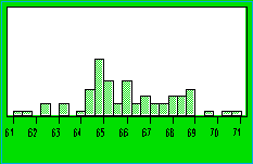
Exercise 2.72
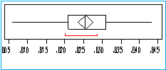
             RATIO
Minimum              0.8060
Maximum              0.8434
Mean                 0.8256
Median               0.8254
Standard Deviation       0.007367554
Is it true that
0.8256=66.02377/(66.02377+13.94585)? By hand, the
fraction comes out to 0.8256, all right. In fact, it isn't true in
general that the mean of a ratio is the ratio of means.